
Description
Google Interact Time Series Chart Maker
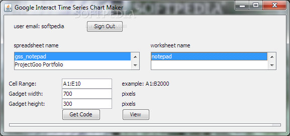
Google Interact Time Series Chart Maker is a super handy tool that helps you plot all kinds of time series data right in your Google Docs Spreadsheet. It's really easy to use! Once you run the program and sign in, you'll see all your spreadsheet documents from your Google Docs account lined up and ready to go.
Get Started with Your Data
After signing in, just pick the data you want to work with. The interface is user-friendly, so you won't feel lost at all. You can quickly view your data and start making charts that look great!
Why Use Google Interact Time Series Chart Maker?
This tool makes it simple to visualize trends over time without getting bogged down by complicated steps. Whether it's for school projects or work presentations, having clear visuals can really make a difference. Plus, it saves you tons of time!
Try It Out Today!
If you're curious about what this software can do for you, why not take it for a test drive? You’ll be surprised at how much easier managing time series data can be.
A Friendly Reminder
This tool is perfect for anyone looking to enhance their spreadsheets with interactive charts. So whether you're a student or a professional, give it a shot! You'll wonder how you ever managed without it.
User Reviews for Google Interact Time Series Chart Maker 1
-
for Google Interact Time Series Chart Maker
Google Interact Time Series Chart Maker is user-friendly and efficient for visualizing time series data in Google Docs Spreadsheets.