
Description
Contraste FOR MAC
Choosing the right colors for text and backgrounds is important when designing apps or websites. Aside from being readable by regular users, this content also needs to be accessible to people who might have various types of visual impairments.
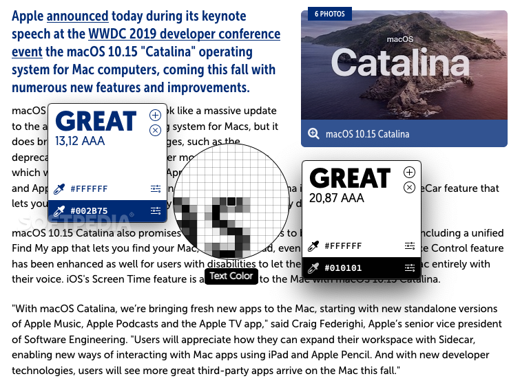
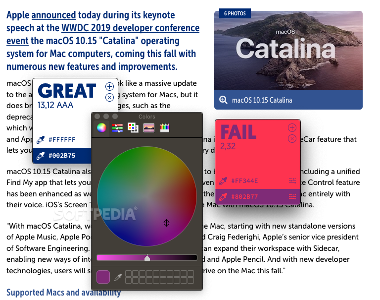
Contraste was created to help developers conform to the requirements of the Web Content Accessibility Guidelines (WCAG). It checks the contrast ratio between the text and backgrounds, and then gives it a rating based on its conformance level.
Key Features:
- Helps developers meet Web Content Accessibility Guidelines (WCAG)
- Determines contrast ratio between text and backgrounds
- Simplifies color selection process
- Allows easy customization and copying of color codes
- Lightweight and intuitive design
Technical Specifications:
- Platform: MAC
- Price: FREE
- Publisher: Laurent Baumann
- Version: 1.0
- File format: ZIP
The Web Content Accessibility Guidelines are intended to help developers meet the needs of all users who might access a certain web page, and they can be applied to desktop or mobile apps as well.
There are three levels of conformance (A, AA, and AAA), and it is recommended to comply with at least the second one (AA), as AAA conformance is not always possible.
Contraste is very simple to use. After launching it, you will see a small window on your desktop, with two color pickers intended for text and backgrounds. All you need to do is select these colors from your app or website, and the conformance level will be determined.
If you want to try out new colors, you can customize them until you find one that conforms to the criteria; then, just click the hex color code to copy it to the clipboard and use it in your project.
Contraste is a great example of how specialized software can be made incredibly lightweight and intuitive. It has no unnecessary features, as it is designed to help you with a single step in the app or web development process – figuring out which colors you should use for text and backgrounds in order to make them accessible to all users.
User Reviews for Contraste FOR MAC 7
-
for Contraste FOR MAC
Contraste FOR MAC is a crucial tool for ensuring web accessibility. It simplifies color selection, promoting inclusivity and adherence to WCAG guidelines.
-
for Contraste FOR MAC
Contraste is a game changer! It's super easy to use and helps me ensure my designs are accessible.
-
for Contraste FOR MAC
I love how straightforward Contraste is! It quickly checks color combinations for accessibility. Highly recommend!
-
for Contraste FOR MAC
This app makes it so easy to meet WCAG standards. I appreciate its simplicity and effectiveness!
-
for Contraste FOR MAC
Contraste has streamlined my design process. It's intuitive and essential for creating accessible apps!
-
for Contraste FOR MAC
Fantastic tool for developers! The color pickers are user-friendly, making accessibility a breeze.
-
for Contraste FOR MAC
Absolutely love Contraste! It helps me find compliant color schemes effortlessly. A must-have for any developer!