
Description
Colour Contrast Analyser
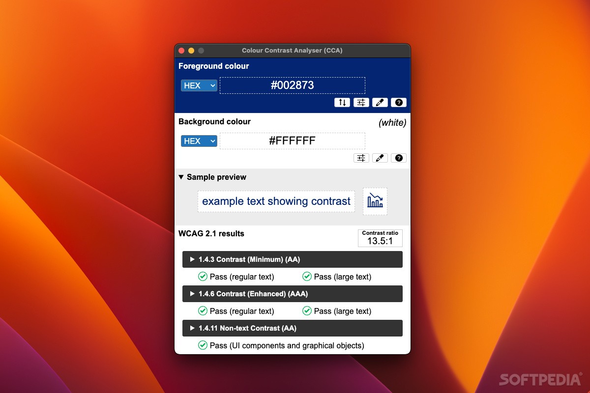
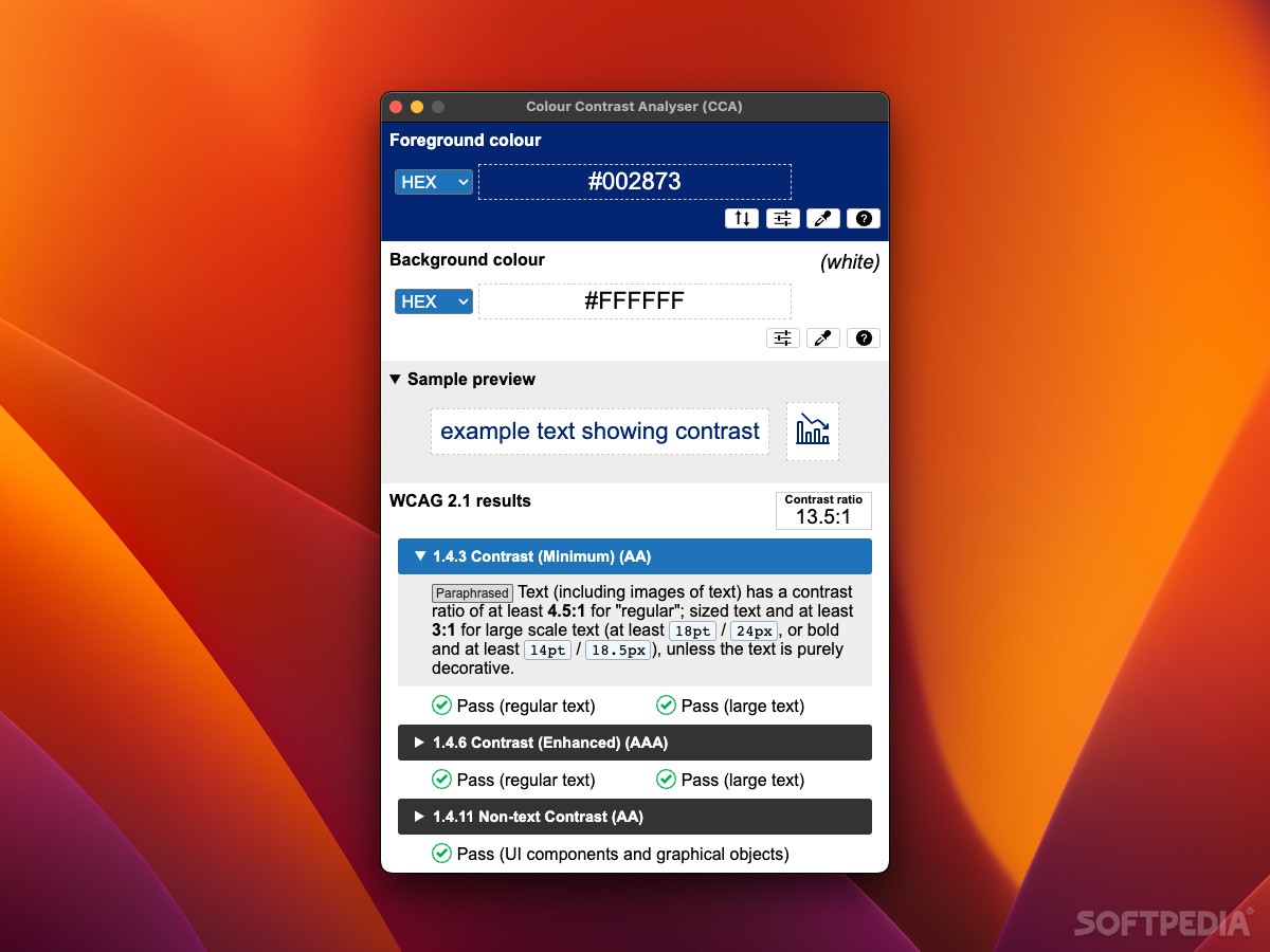
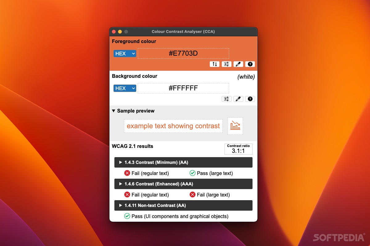
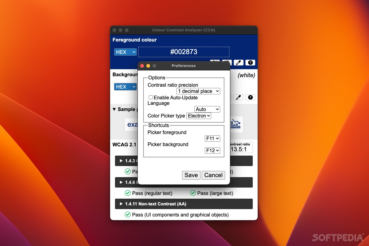
Colour Contrast Analyser is a handy tool that helps you check the color contrast on your website or app. Sometimes, it isn’t super clear if the text is easy to read for everyone, right? That’s where guidelines like WCAG (Web Content Accessibility Guidelines) come in. They help developers create content that's accessible to all.
Why Use Colour Contrast Analyser?
This Electron-based app is really straightforward to use. It helps ensure your color choices meet those WCAG standards. You don’t need to be a tech expert; just open up the app and pick your foreground (text) and background colors.
Easy to Navigate
The cool thing? The app window stays on top, so you can easily grab colors from other windows without losing track of what you're doing. Plus, there are hotkeys that make this even simpler!
Selecting Colors Made Simple
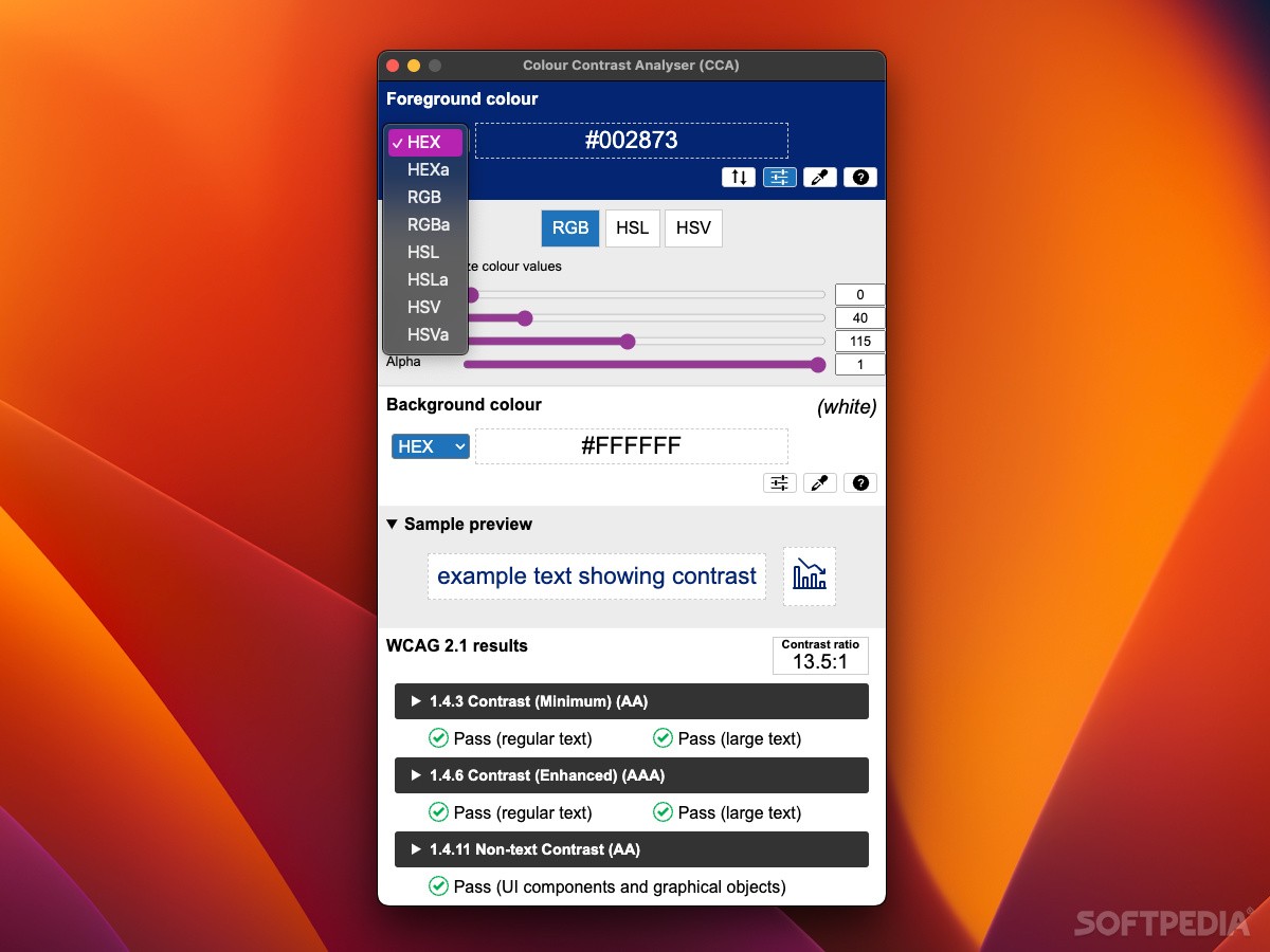
If you're still deciding on colors, you can enter color codes in various formats or adjust them with sliders. And guess what? You’ll see a small preview of how the text looks against your chosen background right away!
Understanding Your Results
In the lower part of the main window, you'll find the contrast ratio and how well your selected colors measure up against WCAG guidelines. It checks everything: regular text, large text, and even graphics.
Tweaking Your Choices
If any of your choices fail to meet accessibility standards, don’t worry! You can click for more details and see why those colors might not work well together. Then tweak them until you get a passing grade!
Importance of Accessibility
With how crucial internet access is these days, making sure everyone can read your content is super important! Apps like Colour Contrast Analyser make it easy to ensure that your website is suitable for all users.
Tags:
User Reviews for Colour Contrast Analyser FOR MAC 1
-
for Colour Contrast Analyser FOR MAC
Colour Contrast Analyser for Mac is a user-friendly tool for checking color contrast compliance with WCAG standards. It's a must-have for web developers.